INNA - property state of mind
In the launch concept for the new brand, a news anchor played by Finnish actor André Wikström reports on breaking property news: the arrival of Inna, a Danish-Swedish-Finnish property company. Inna's representatives from each country, all suspiciously similar in appearance, fielded the reporter's tough questions and left the viewer thinking how lucky it was that these like-minded professionals finally found each other!
How did we get here?
Finnish-Swedish Retta Management and Danish Cobblestone merged to form a new Nordic property management company. The merger called for an entirely new brand that would work across all three markets, Finland, Sweden and Denmark, and stand apart from the industry's big players such as Newsec, CBRE and Colliers.
Retta (as the company was previously known) had already started a naming process, but no decision had yet been made. We therefore worked under the name "BrandX" throughout the project.
Blink was responsible for the project as a whole and for coordinating the collaboration between the countries. In two workshops, held both on site and remotely, we laid the foundations for the new brand's strategic positioning, communication platform and visual identity.
Workshops brought tacit knowledge to the surface
The brand work was carried out in close collaboration between the country organisations. Key people from each country unit took part in pre-assignments and joint workshops, where we:
- defined typical buyer personas (ICP), including their decision-making criteria, purchase drivers and barriers to buying
- identified brand archetypes
- mapped out potential positioning dimensions and brainstormed core promises that could anchor the positioning
- explored a visual direction for the new identity, using methods such as benchmarking
Working together allowed us to develop the brand and deepen our understanding from multiple perspectives. This gave us a strong set of design drivers for the concept work.
A strategic, distinctive core
We turned what some might see as a limitation into the key differentiator, the company's exclusive focus on property. From this we shaped the core of the brand, the idea that for true professionals, property is a state of mind. As English is the group's corporate language, the promise was distilled into:
"Our property state of mind. Your peace of mind."
Dedication to property is a promise to the client. Because the people at Retta, and now Inna, think only about property, you're free to think about everything else.
Visual identity
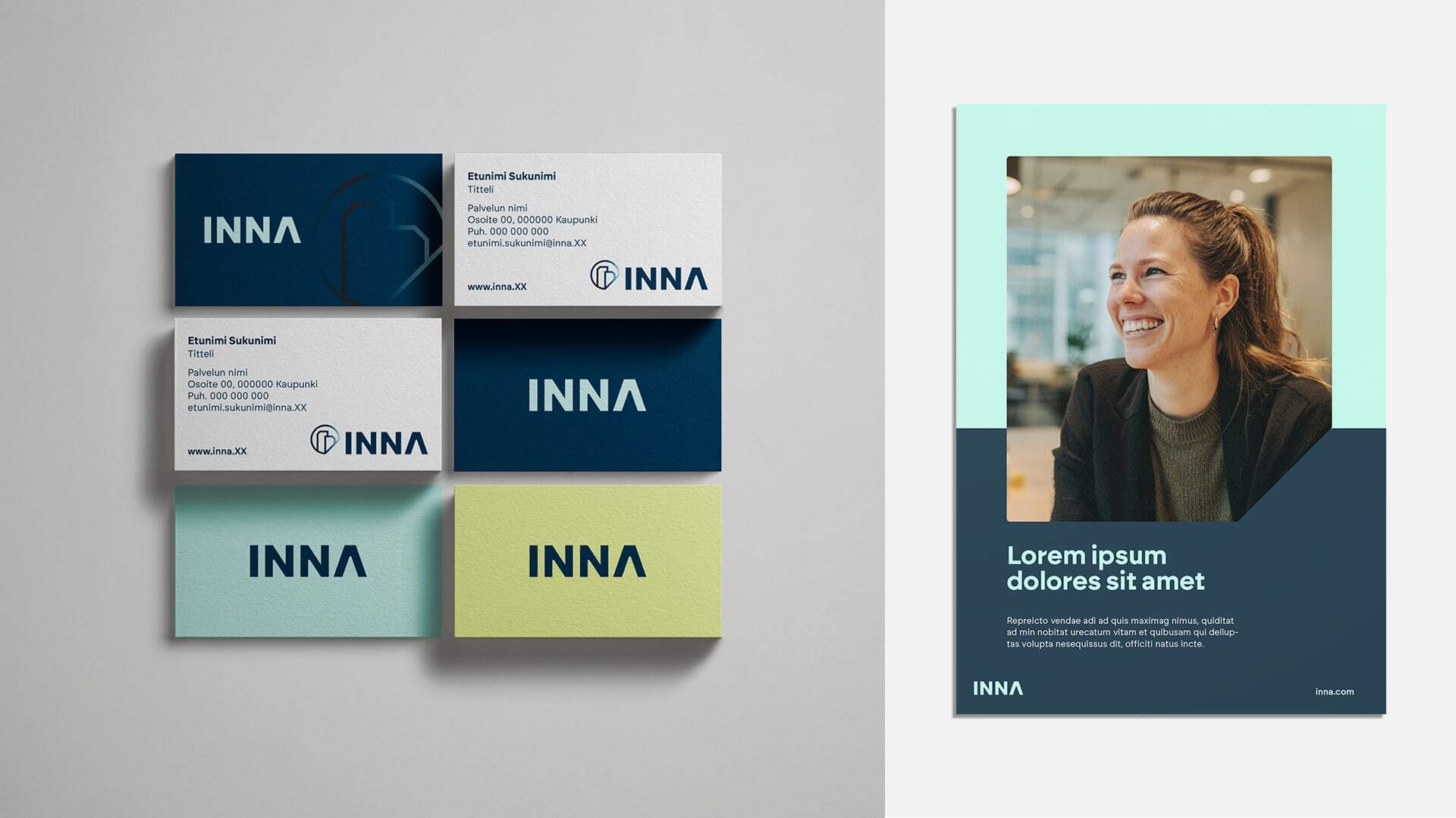
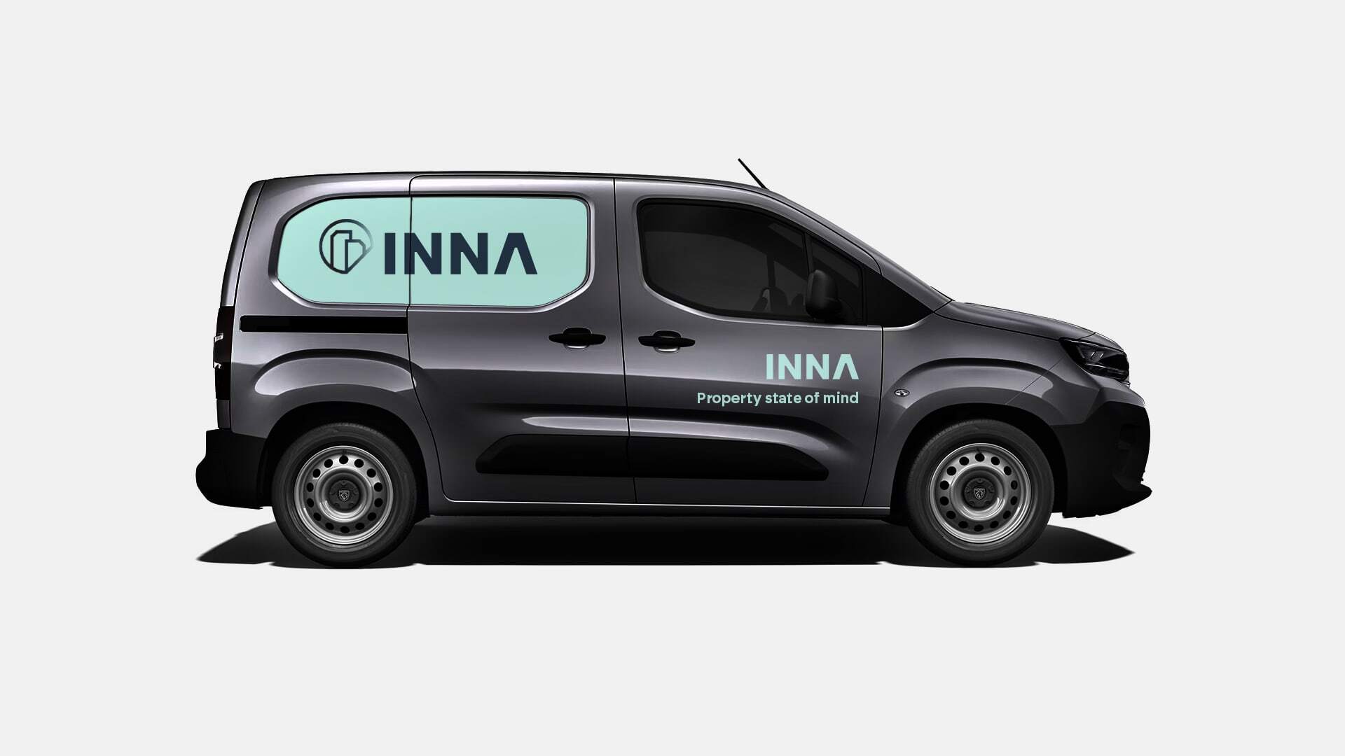
The visual identity is built around three logo elements: a text-based primary logo, a combination logo (wordmark and symbol) and a standalone symbol. The angular, solid shapes of the primary logo are designed to convey strength and reliability.
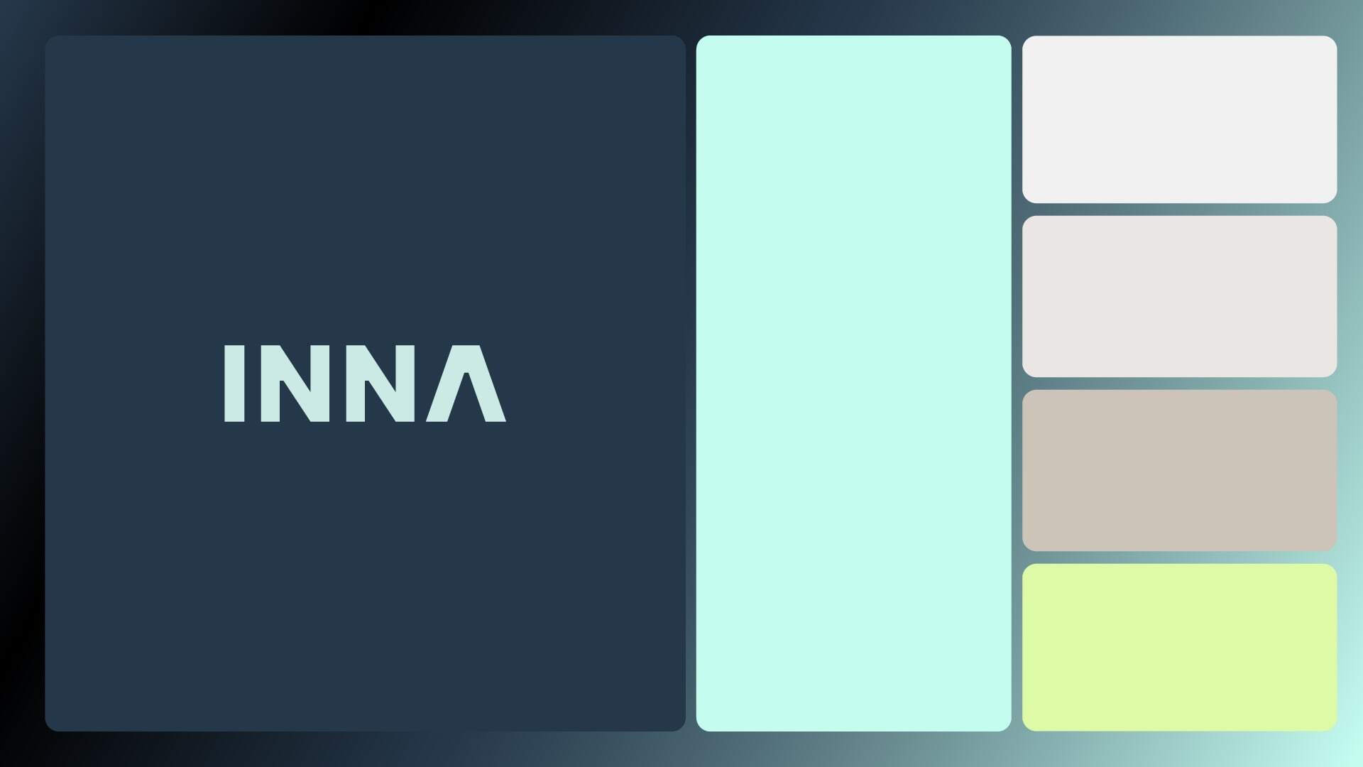
The colour scheme is divided into two palettes. The main brand is based on charcoal and mint, a modern and calm combination that communicates expertise and trustworthiness. The residential rental sub-brand was given its own colour identity in energetic, approachable lime and pink. Distinctive in its own right, yet clearly part of the same family.
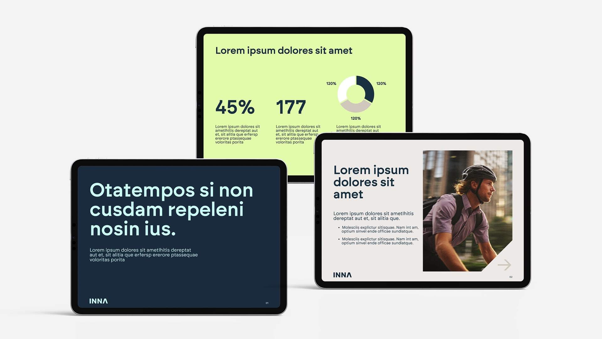
The typography uses three typefaces: the geometric Brockmann for headings, the warm Work Sans for body text, and Arial for office materials. Together they cover every use case with a consistent voice.
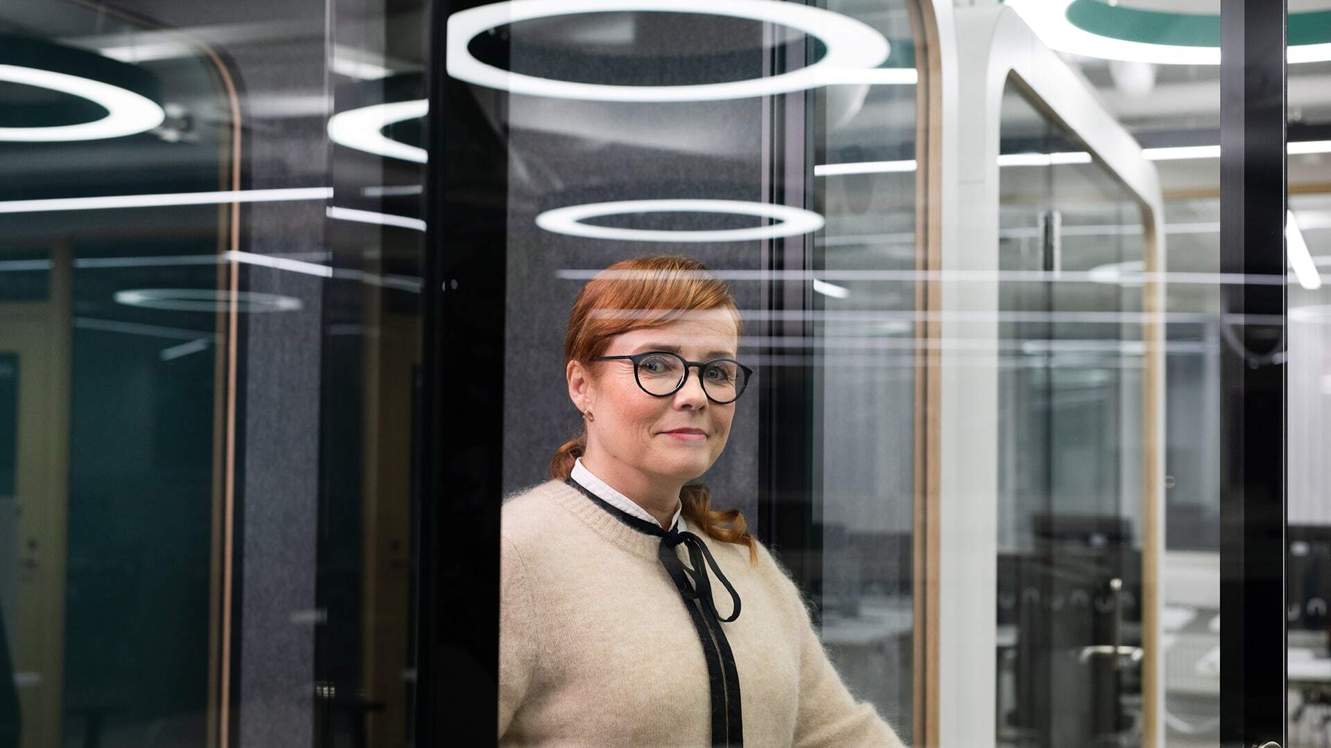
The brand's imagery is rooted in authentic moments with people at the centre. A diagonal cut in the lower right corner recurs across selected images, adding a dynamic and recognisable element to the identity. The brand photo shoots featured both Inna employees and amateur models.
Pyydä tarjous tai varaa aika tapaamiselle!
Tutustu muihin referenssehin!