Skip navigation

Simplified user interface for a content heady website
- An example of UI design expertise

A Finnish gaming organisation RAY/Veikkaus needed to renew its intranet, to better meet the evolving needs of both users and the organisation. The aim was to find a simple, usable and functional way to manage and utilise the massive amount of content. The card metaphor-based GUI structure provided a solution for straightforward content management, an intuitive user experience and a responsive implementation.

At the start of the project, the intranet, “Rahikainen”, had over 20,000 content pages. One of the main challenges in the project was the massive amount of content (which was growing constantly) together with the fact that the content was also rather diverse: everything from event invitations to noticeboards and HR documents. It was obvious that a traditional information structure and navigation model would make the intranet difficult to understand and poorly usable.

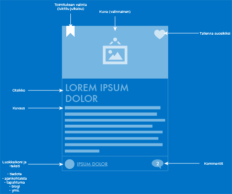
Given the large and thematically heterogeneous content, we opted for a GUI approach based on a card metaphor. This both clarified and simplified the user experience. The usability of the service was significantly improved while there was no need to prune the content. The card-based GUI approach also made the new intranet highly usable regardless of the device or browser.

Ray sivusto rautalankka malli osa 2

The new intranet made it possible to use it in two ways. There is a section called “Virta” (“stream”) which continuously brings live content, such as various feeds for users to read and comment on (bulletins, news, blogs, etc.). At the same time, the user can choose to navigate the content via “Pakki” (“toolbox”). It is a collection of more static content, various work-related documents, services and tools.

ray_ipad_iphone

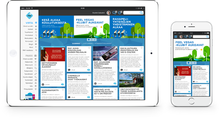
In addition, several complementary ways of accessing content were designed. In addition to editorial highlights, personal favourites and various organisation tools, navigation, directory and search were also included in the new intranet user interface. This allowed the service to meet the requirements of both entertaining browsing and performing a specific task.


In terms of visuals, the aim was to create a branded experience that was both contemporary and timeless. The aim was to keep the expression minimalist and tool-like, so that the content itself would take the leading role it deserved.

Statistics

Results
  • + 1 k The amount of pages
  • + 1 The amout of users
  • 1 The amount of content categories

Testimonial (project owner)

"Blink Helsinki had an excellent vision for a service that would naturally adapt to different ways to use the intranet. The end-result is highly user-oriented. There are more than 20 000 different content pages and more will be added all the time. The information structure of the service now enables users to find relevant information easily."

- Communications Director Jari Elo

Want to have a chat? Feel free to

book a meeting 👉